
Leadership & ROI BI Dashboards
•• 3 min read
Turning rows into revelations – so leaders can spend less time hunting for answers and more time acting on them.
1. Why this work matters
When I joined SpareBank 1 Finans Østlandet six years ago, the Business Intelligence landscape was a patchwork of static tables and one-off charts. Decision-makers got numbers, but rarely context. My mandate quickly became clear: transform raw finance data into an intuitive decision-support system that scales.
2. Raising the visual-analytics bar
| Before | After |
|---|---|
| A handful of reports, mostly basic bar/line charts | dashboards covering all bases with unified styling and navigation |
| KPI targets buried in Excel or PDF decks | On-screen KPIs with traffic-light status and thresholds |
| Period-to-period comparisons required manual exports | Dynamic 12-month rolling windows & ad-hoc date slicers |
| No, or poor, brand consistency | Design system (fonts + colour palette) now shared across BI team |
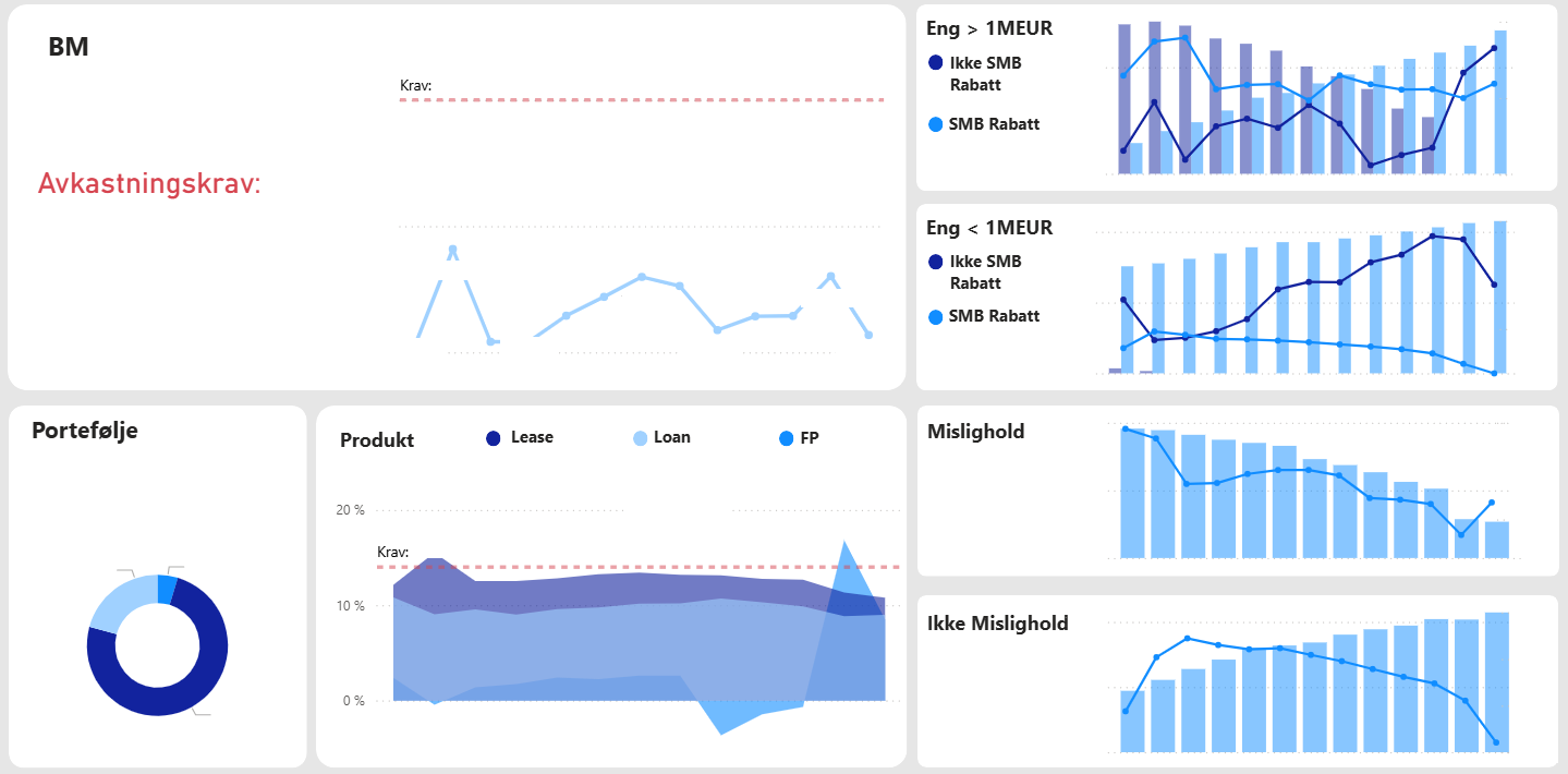
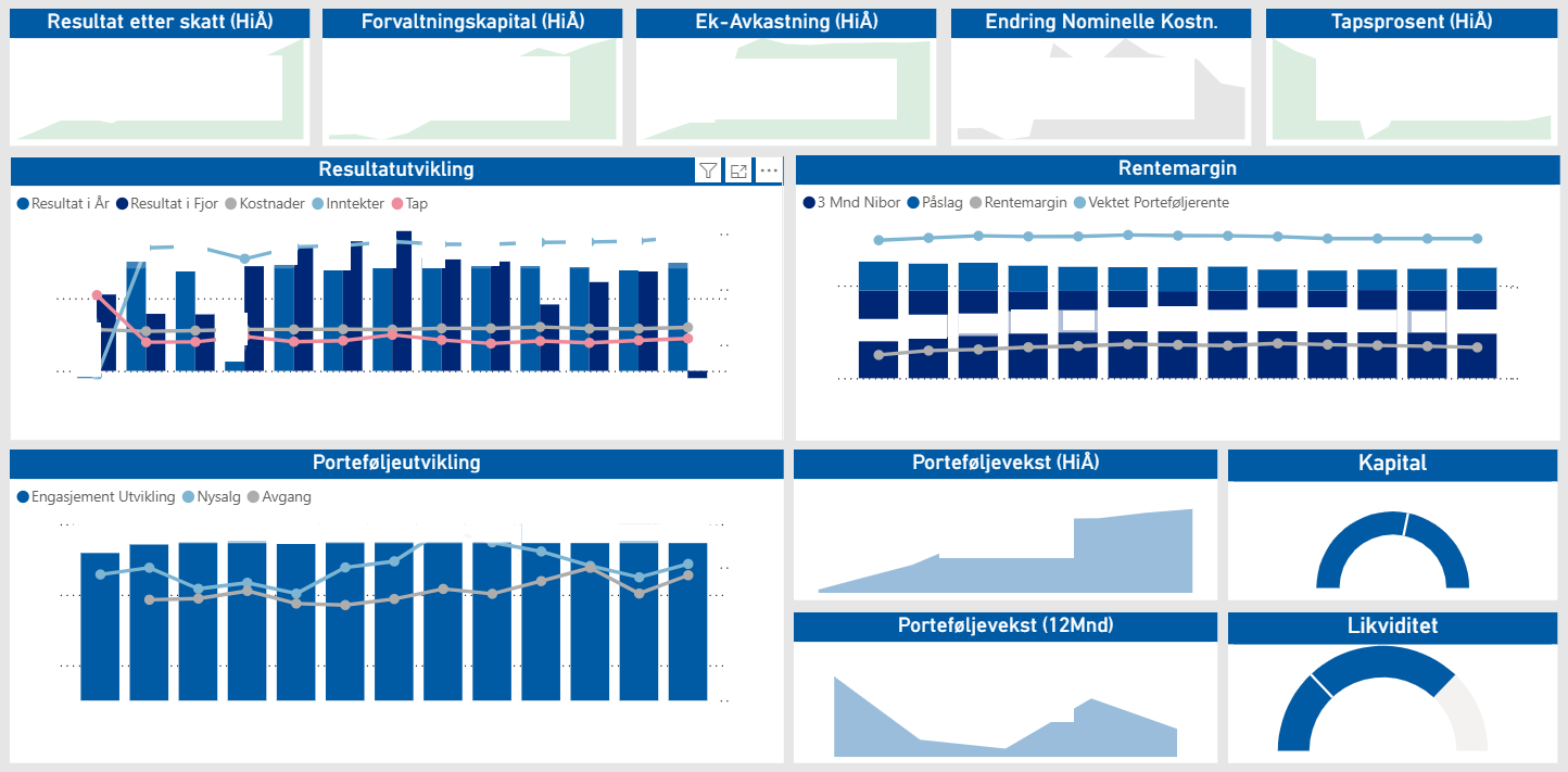
3. The flagship: The Overarching Leadership Dashboard
One page to rule them all—profit, loss, balance sheet, and risk at a glance.
Key features
- Executive-level snapshot – Top-tier KPIs (resultat, balanse, tap, kostnader, inntekter) surface immediately upon load.
- 12-month rolling slicer – Pick any month; the visuals roll forward 12 months so leaders see trend lines in context.
- Drill-down pathways – Click on a negative outlier and tunnel all the way to the contract behind it—no separate report required.
- Consistent storytelling – Every visual carries the same colour semantics (green = positive, red = negative), so patterns leap out faster.
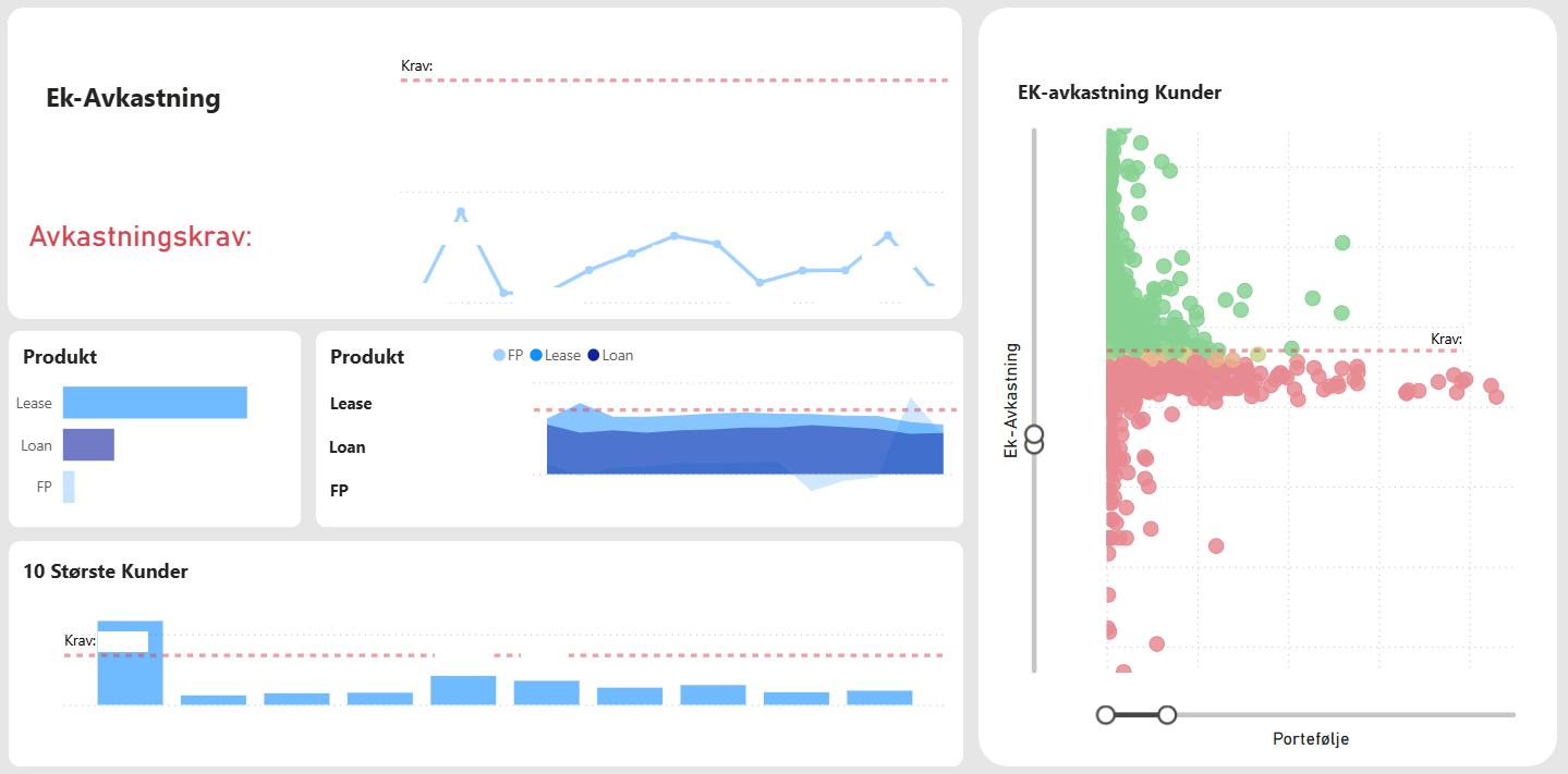
4. The game-changer
From revenue-only thinking to investment-grade insight.
What makes it different
- Return on Equity (RoE) focus – Shifts attention from gross totals to actual value creation.
- 360-degree slicing – Filter RoE by sector, dealer, salesperson, contract, product line—instantly.
- Early-warning flags – Pinpoint underperforming contracts before they erode profitability.
- Personal performance views – Sales reps see their book of business against the same RoE yardstick used by leadership.
Outcome
- Re-allocation of lending capital toward sectors with > 12 % RoE.
- 15 % drop in low-margin contracts within six months of launch.
- Culture shift: performance conversations now start with value, not volume.
5. My role & tech stack
- Lead dashboard architect & developer (Power BI Desktop & Service)
- Data modelling: DAX, incremental refresh, aggregate tables for speed
- ETL: SQL Server stored procedures + Power Query
- Governance: defined naming conventions, colour tokens, and data-source-certification process
6. Lessons learned
| Lesson | Why it matters |
|---|---|
| Dashboard ≠ report | Executives want a narrative, not a data dump. |
| Style guides pay dividends | New reports now “feel” part of the suite with near-zero design review. |
| RoE beats revenue | Quality of growth > quantity of growth—especially in finance. |
| Usage analytics tell the truth | The most-clicked visuals weren’t always the ones we expected. |